More on eigenvalues and social networks
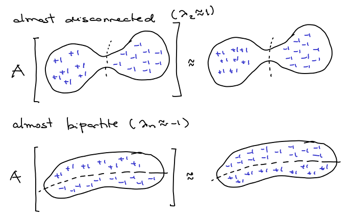
Following the suggestions of some of my friends, I decided to look at the other eigenvalues. The intuition is that if an eigenvalue is close to , it must also represent a good partition of the graph. Therefore I ploted the same graph as in my last post but associating each node
with the coordinates
where
is the eigenvector corresponding to the
-th eigenvalue. The first eigenvalues are actually very close to
. I have:
(as expected),
,
,
,
, … For my suprise, plotting
gave a nice and natural separation between the nodes representing people from my family (in yellow) and the other cathegories:
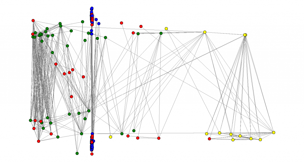 Also, I looked at this version of the graph with people names, and I noticed that people with extreme values of
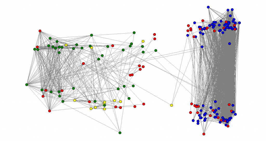
 are very good representatives of their respective clusters. In that first graph (in the other blog post), we got a good separation of my high-school friends (in green) and my undergrad friends (in blue). The nodes in the extreme right are my friends I used to hang out more with in college – they are people that are definitely in that cluster. The same about the friends in the extreme left, they are definitely in the other cluster.
Now, let’s turn our attention to the picture above. Not only the yellow nodes were clusterized, the blue nodes appear to be all in the same place, as if the main cluster identified in the last eigenvector all collapses to one point. If we look further at the fourth eigenvector, this phenomenon still happens:
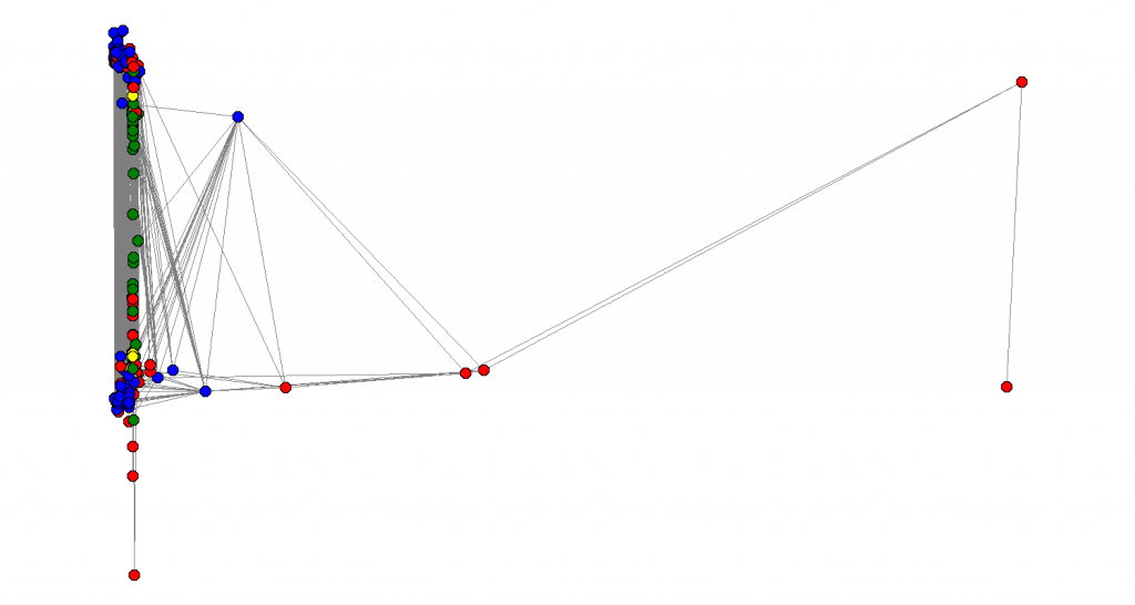 See how all the nodes that were somehow “important” in the last two graphs all collapse to the same place and now we are trying to sort the other nodes. How far can we go? Is there some clean recursive way of extracting multiple (possible overlapping) communities in those large graphs just looking in the local neighborhood? I haven’t reviewed much of the literature yet.
Eigenvalue density
I am also curious about how is the distribution of the eigenvalues of that graph. For example, the following graph shows the “eigenvalue density”. We know that , but how are they distributed in this interval. The largest eigenvalue is
and the smallest is
. The next plot shows the distribution:
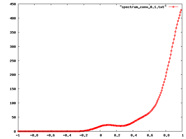 Most of the eigenvalues are accumulated on the positive side (this graph really seems far from being bipartite). Another interesting question if: how can we interpret the shape of this curve. Which characteristics from the graph can we get? I still don’t know how to answer this questions, but I think some spectral graph theory might help. I really need to start reading about that.
Next, I plotted the points in a graph and got the following pattern:
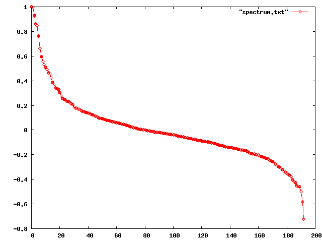 This seems like a nice symmetric pattern and there should be a reason for that. I don’t know in what extent this is a property of real world graphs or from graphs in general. There is this paper by Mihail and Papadimitriou analyzing the structure of eigenvalues in real world graphs. They propose a model for explaining why the highest eigenvalues seem to be a power-law distribution, i.e.
 for the first
eigenvalues. They claim the eigenvalues are close to
where
is the
-th highest degree. Therefore, since
follows a power law, $\lambda_i$ should also follow.
Although the whole social netwotk follows a power-law (more about power-laws in this nice survey by Mitzenmacher), we are dealing with a local neighborhood and even the degrees in the graph don’t follow a power law, as we can see in the following log-log plot of and
:
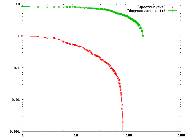 Even though they are not a power-law, they still seem to have a similar shape, which I can’t exacly explain right now. Papadimitrou suggests that the fact that
 is a negative result, since
seems to be reflecting only a local property of the graph. Here it seems to be following a similar pattern, however, we saw that we can get some nice global and structural properties from that, so it doesn’t seem to be reflecting only local properties.
